Healthfirst is New York’s largest not-for-profit health insurer, offering high-quality, affordable plans to fit every life stage, including Medicaid plans, Medicare Advantage plans, long-term care plans, qualified health plans, and individual and small group plans.
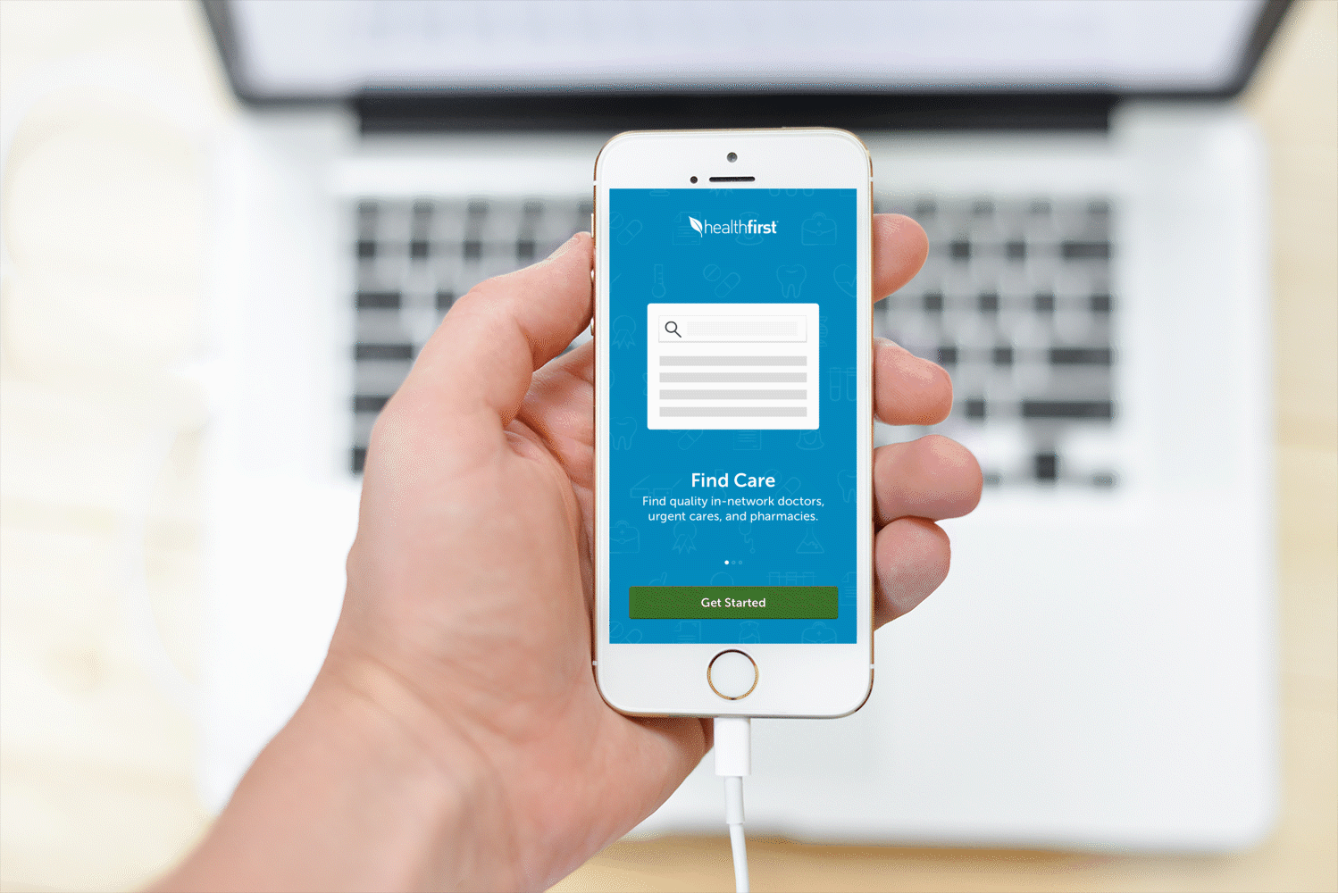
Like most insurance companies, Healthfirst excelled in its member base and customer-driven approach. However, their lack of user research was impeding their ability to make strategic decisions that could radically improve their offerings and harmonize their services. The company offered clients an online website for members to access their plan, but an overabundance of information and a lack of design updates over several versions contributed to a cluttered member platform with a clinical feel, leaving a dated impression on visitors. Our goal was to help bridge the gap and improve member experiences. Our ongoing partnership included research and design to create a robust system that enabled members of different plans to access care in a uniformed pattern.
'Keeping the care in Healthcare' by working around the clock to connect Healthfirst members to the care they need with the features they desire. The objective was to design a user-friendly mobile app that enables members to:
With so many benefits and features obscured, Healthfirst struggled with prioritizing its content, presenting its essential features, and empowering members to take easy actions. By combining research and strategy key features were presented to members during their app onboarding experience to familiarise members with the app facilitating positive user experience.
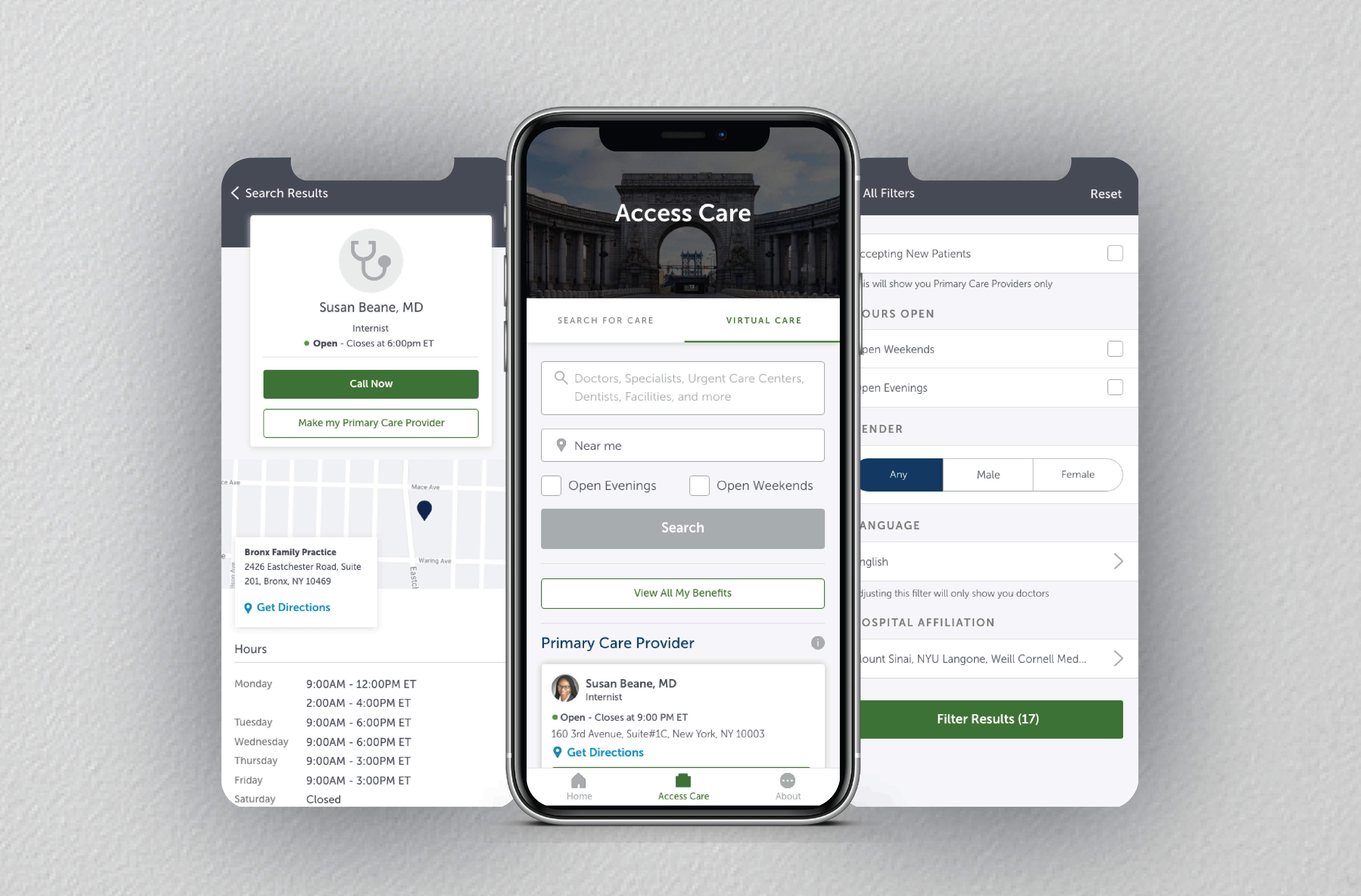
By putting member needs at the center of the product process, and empathy at the core of the customer journey, we’ve helped Healthfirst develop a simplified approach to enable members to get the care they need at a time they need it. By incorporating a simplified symptom search, members can find providers based on their care needs and filter the provider list based on their preferences. The quick and easy access to their digital ID allows consumers to have ready access to their ID card information via their phone—which includes the same information that is on their printed ID cards today.
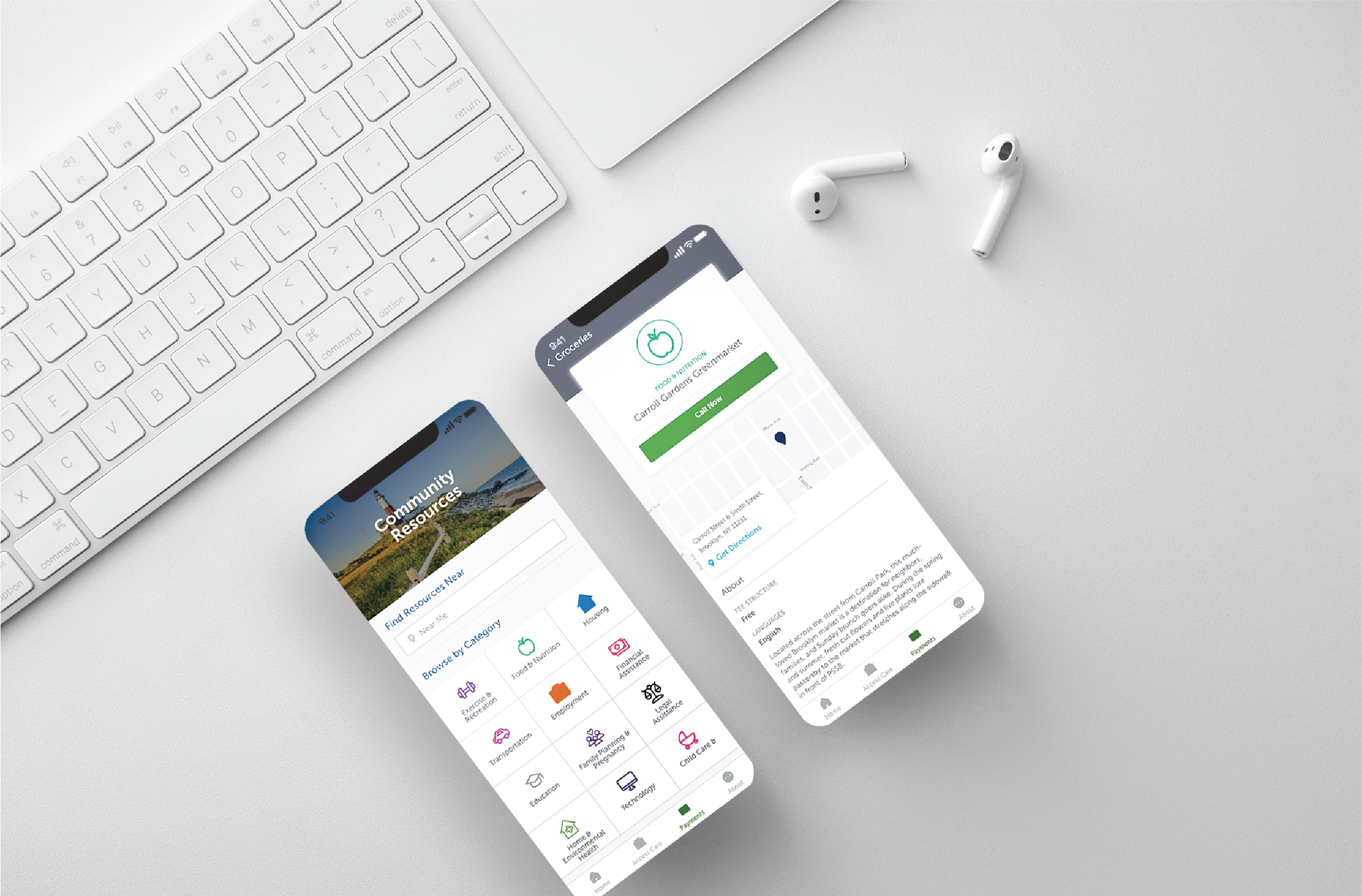
Although Healthfirst had a proven track record for getting its members on track to meet their health goals, they were unaware of their member's underlying needs and pain points. Since Healthfirst largely caterers to Medicare and Medicaid patients from a lower income group we decided to partner with NowPow to provide members with resources such as food, housing, education, employment, financial and legal assistance, and more.
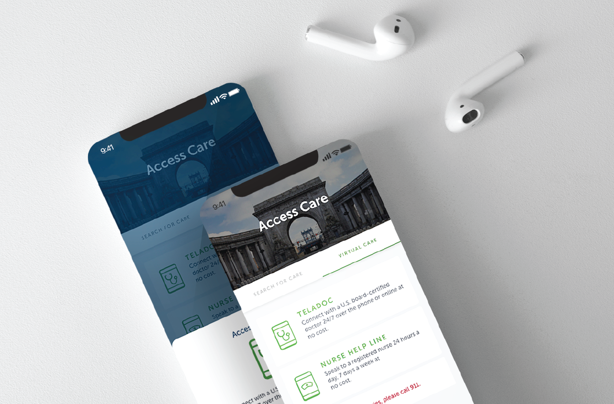
To promote on-demand healthcare—wherever, whenever a Teladoc feature was introduced enabling members to receive timely medical care without having to visit the emergency room. By launching this feature during the spread of Covid19, virtual checkups were made possible from the safety of one's home.
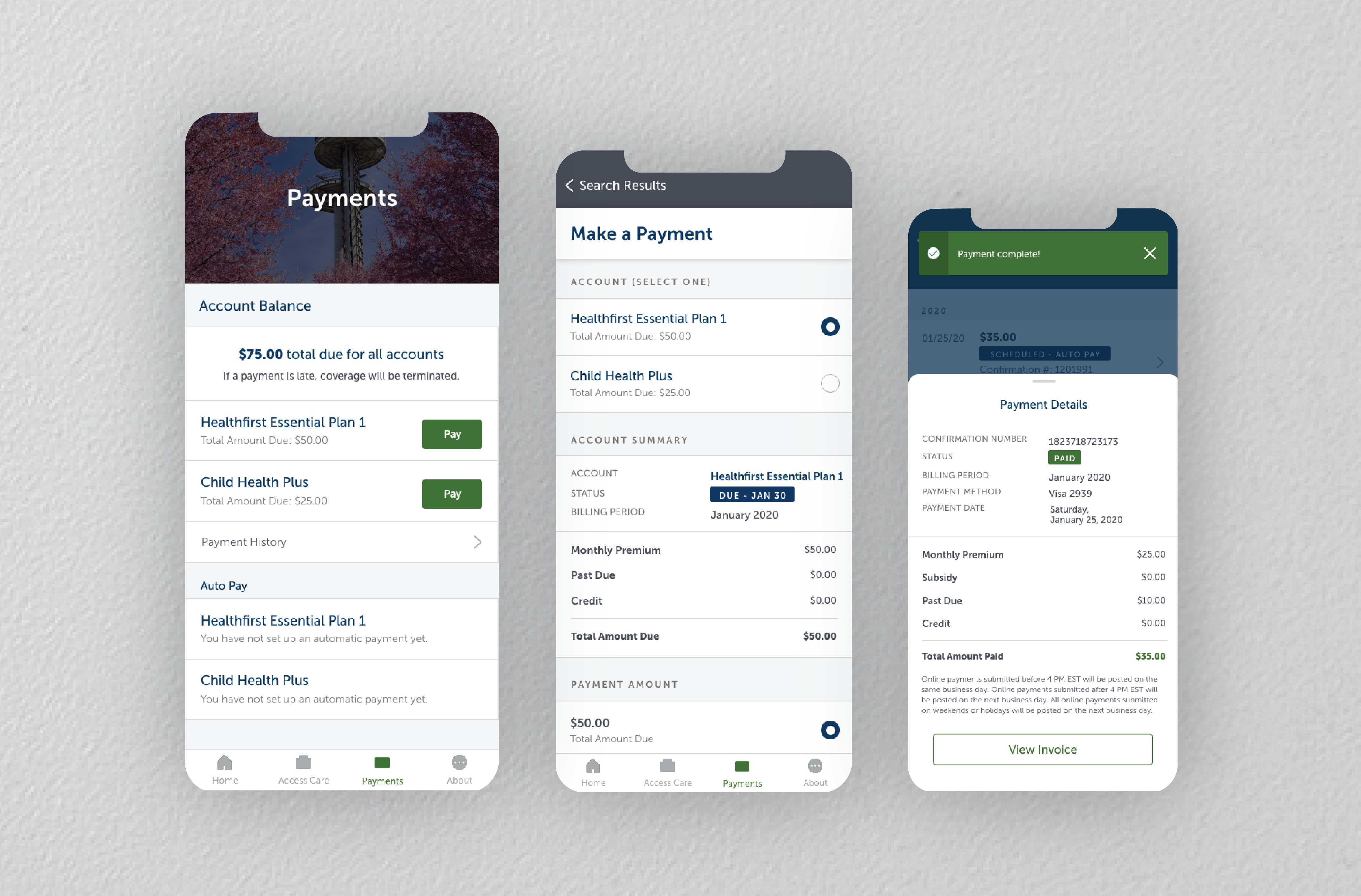
Making premium payments are complicated enough. Imagine having to make separate payments for you and your dependents. By simplifying the payment process, we made it possible for members to make payments for them and their dependents at once. We organized the entire payment process into some small steps making it easy for users to understand the breakdown of their payments and keep track of their payment deadline so as to not lose coverage.
While the purpose of the app wad to enhance member satisfaction, the launch of this app was significant as it's release was based on decisions made as a result of Covid19. With an original go-live date in July 2020, we decided to pivot and release a slim version of the application in May. To cater to the pandemic centric needs the slim version provided immediate telemedicine access to members in New York City enabling them to access care and avail resources from the comfort of their homes.
I create meaningful & interactive experiences through design. My prior experience as a Business Analyst combined with my skills as a UI/UX designer gives me the unique ability to analyze both client and user needs to come up with creative solutions.