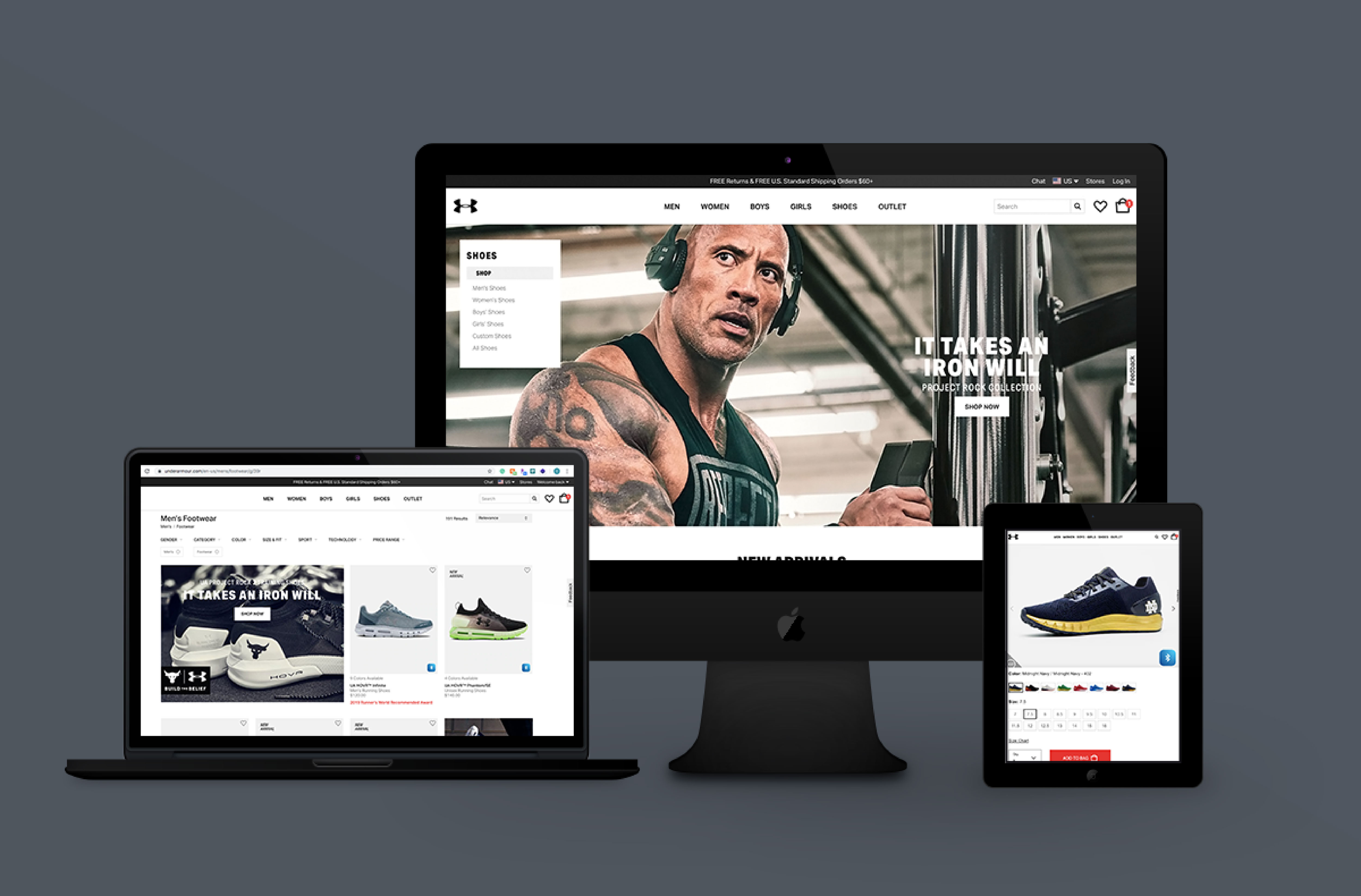
Under Armour produces performance footwear, apparel, and equipment. With a mission to make all athletes better through passion, design, and the relentless pursuit of innovation, Under Armour products are sold worldwide to athletes at all levels. However, when visiting their website, I couldn’t help shake the feeling that the experience just didn’t reflect the iconic reputation of the brand. This marked the beginning of this project and challenged my design thinking.
ROLE & STRATEGY
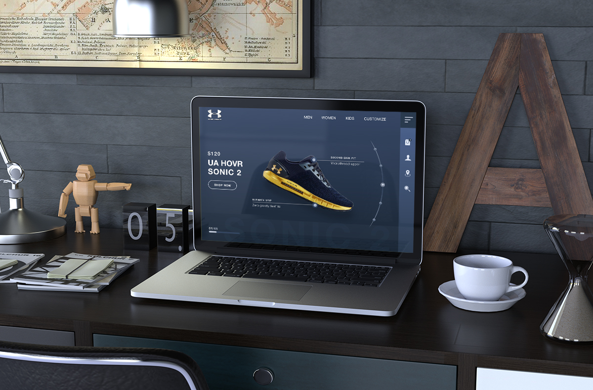
Being a self-directed project, the web redesign was done by me solely for the love of design, and in the interests of self-discovery and learning. The goal was to re-imagine the digital experience and discover new ways to create a modern, cleaner, cohesive shopping experience.
PROBLEMS WITH THE EXISTING UI
Clear use of a bland, antiquated web template with small font that does little to demand attention.
Too many options resulting in the navigation menu being cluttered with links. The page headline is where everything begins — interest, attention and understanding. It loses value when it’s cluttered because nobody gets happier with maximum freedom of choice. This can certainly cause issues with navigation. 37% of users claim they get annoyed by poor design and navigation on website and that’s the main reason they leave.
Product features are not clearly highlighted and the account button is hidden away in the top right margin.
Choice of typography and color palette creates an unclear visual hierarchy.
The check out and payment process is poorly designed and taxing.
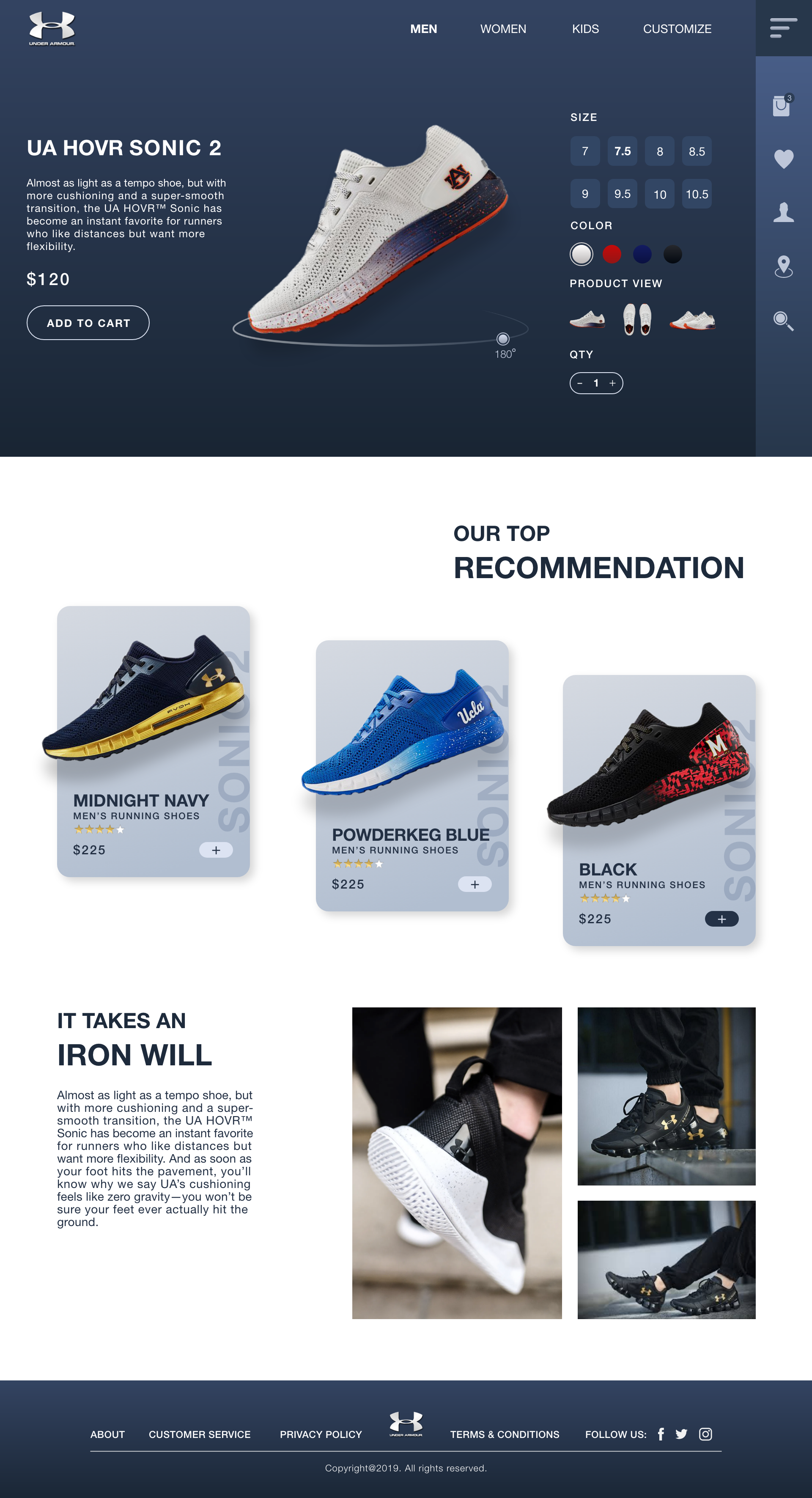
GAME PLAN
Create a clean information architecture that organizes the brand’s offerings to help users easily find what they’re looking for.
To minimize the aesthetics of the navigation menu to improve navigation.
To improve the user interface of their product pages without compromising its integrity.
Refresh the look and feel of the website in a way that reflects the brand value.